Background
Birch's ICE platform, a Windows desktop application originally developed in the late-1990s, was the company's operational support system. As the platform aged, it became increasingly difficult to maintain and business knowledge of ICE was often lost as previous employees left the company.
To address these issues, the application development team led the initiative to transition ICE to a software-as-a-service (SaaS) platform that would later be named CUE. By reinventing ICE as a SaaS-based web app, issues relating to application instability and the need to download software updates to every local machine with each new release of ICE could be eliminated.
Project Team
My Roles
UX Researcher, UI/UX Designer
Team Members
Business Analyst, Product Owner (Manager of Service Delivery), UI Developer, Development Manager
Project Tasks
1. Research
Interview and sit with operations center staff as they use determine application pain points, discuss ideas for improvement, and create user personas, work with product owner to determine and prioritize which features would most effectively improve operations center productivity
2. Design
Whiteboard ideas for improved screen layouts and component placement, create wireframes and high-fidelity prototypes
3. Build
In collaboration with UI developer, define and implement UI features and behaviors
Research
As a new platform designed to address usability concerns raised by call center employees at Birch's operations center, it was critical that I speak to a variety of individuals who were daily users of ICE. I spent a couple of days at the Birch operations center in Macon, GA sitting with and observing employees who performed their daily routine in ICE and then interviewing them for feedback on ICE and their wish lists for improving the app.
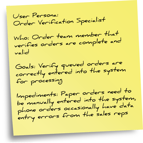
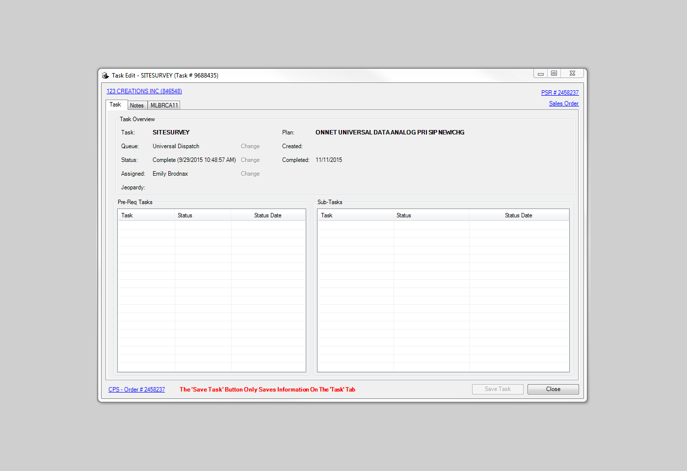
As I observed how they interacted with ICE, I documented their usage patterns and noted instances where ICE’s layout or workflow exhibited poor efficiency. For instance, certain tasks had issues where data elements were not flowing through to a later screen state. This resulted in instances where users had to input the exact same data on multiple screens, or temporarily record data to another app such as Notepad.
In my informal interviews with these same team members, I asked them questions such as what were the top improvements they would like to see in a new version of the app and how fixing those problems can help them perform their jobs better. This helped me develop the user personas with our business analyst to define what an employee in a specific role needed from the app to optimally perform their job.
Design
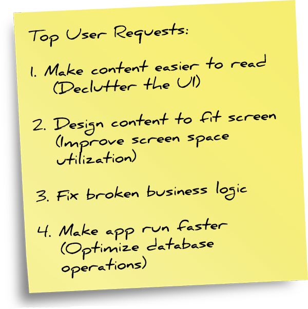
With the knowledge that I gathered from my time with the operations center team in Macon, I began to look at ways to improve upon some of the issues in ICE. A large portion of the usability issues in ICE stemmed from either clutter in the old desktop interface or incomplete or broken business logic throughout the app.
There was also a third major area of potential improvement, which was application speed. While this wasn’t something I could design, it remained an important attribute to emphasize to the development team. I had to record how long it took to fetch data in search queries and other database operations to provide as a baseline for improvement.
User Interface Improvements
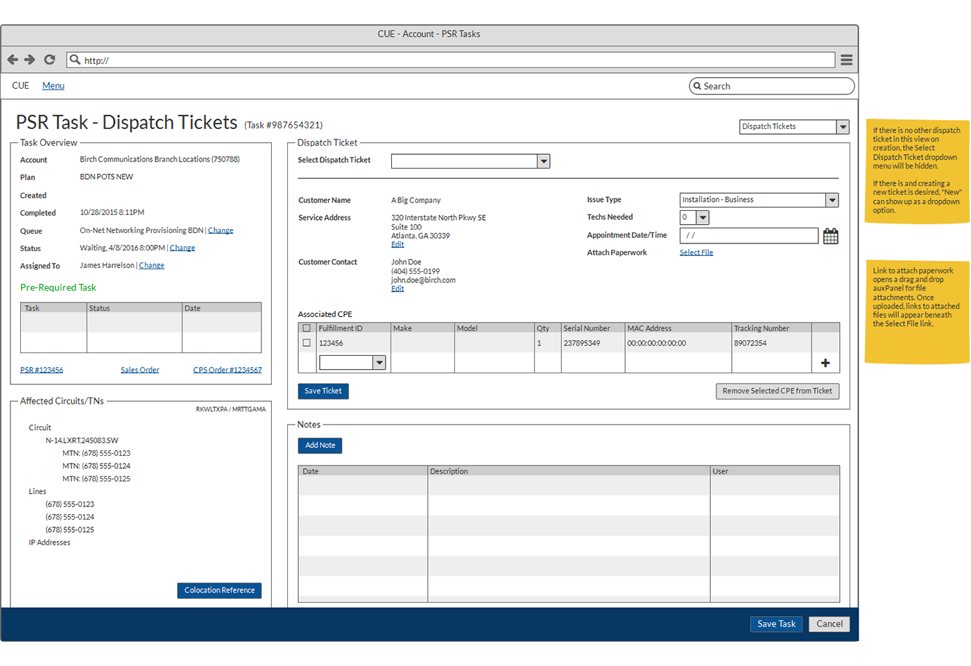
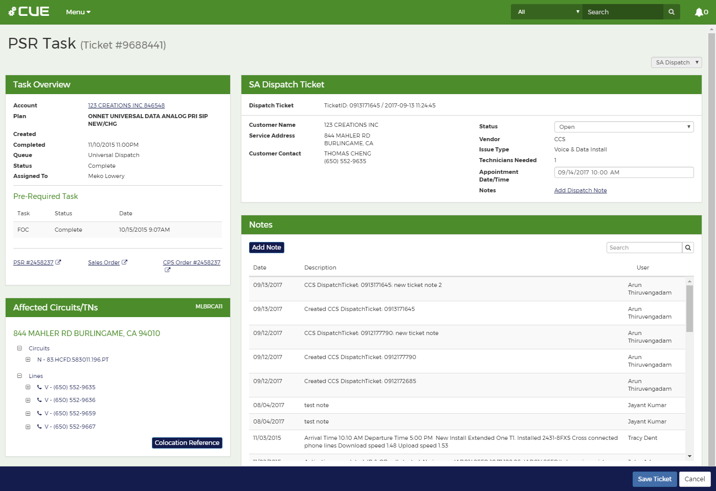
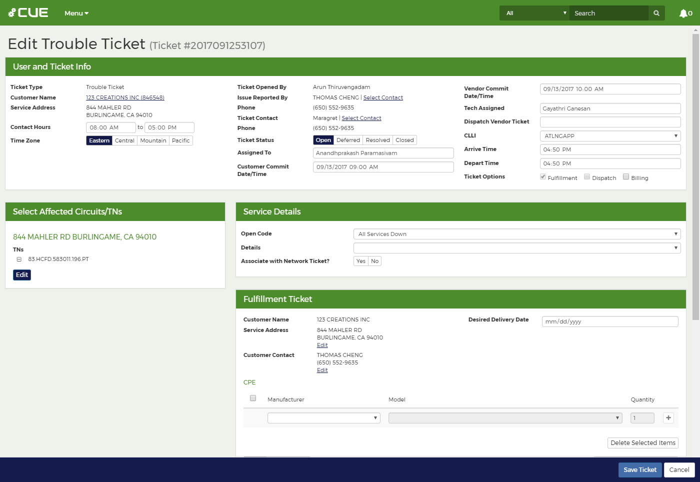
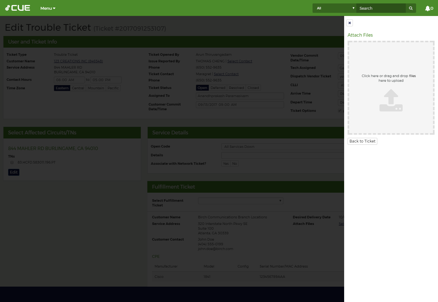
On the first day of my visit to the operations center, I realized that one of the easiest ways to declutter the ICE interface would be better use of color and typography. I cannot claim to know what challenges exist for implementing these changes in a Windows desktop app, but it is one of the most obvious and straightforward changes that can be made in a web app. I planned to use colors to tag customer accounts with specific account categories for easier identification, emphasize default button actions, and visually distinguish different containers of data.
With typography, the ability to vary font sizes, weights, and faces could give CUE greater content visibility as page headers, subheadings, form labels, and data fields could all have distinct styles. However, one of the best ways to improve the readability and context of various screens in the UI was to use more descriptive labeling.
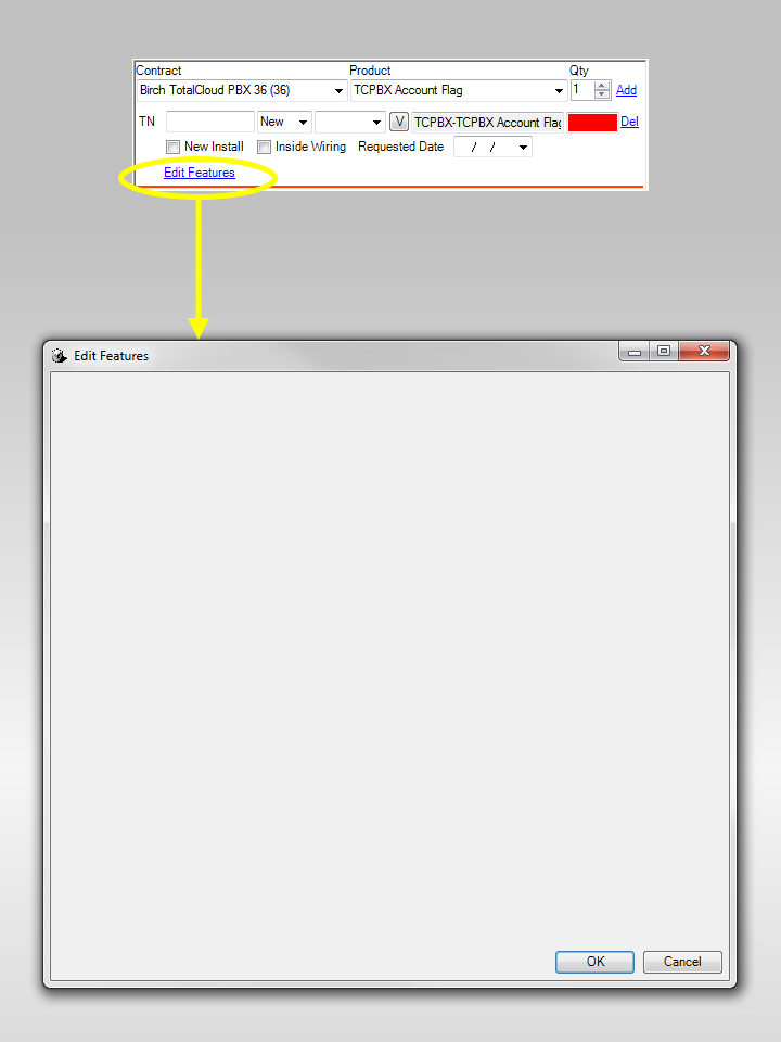
One of the earliest issues I had struggled with in comprehending the ICE interface was how much some screens relied on abbreviated text labels. While it may have been a space-saving measure back when the average screen resolution of monitors was smaller, abbreviated text labels were frequently confusing. They made little sense to newly hired employees as well as those who did not regularly use the screens in ICE.
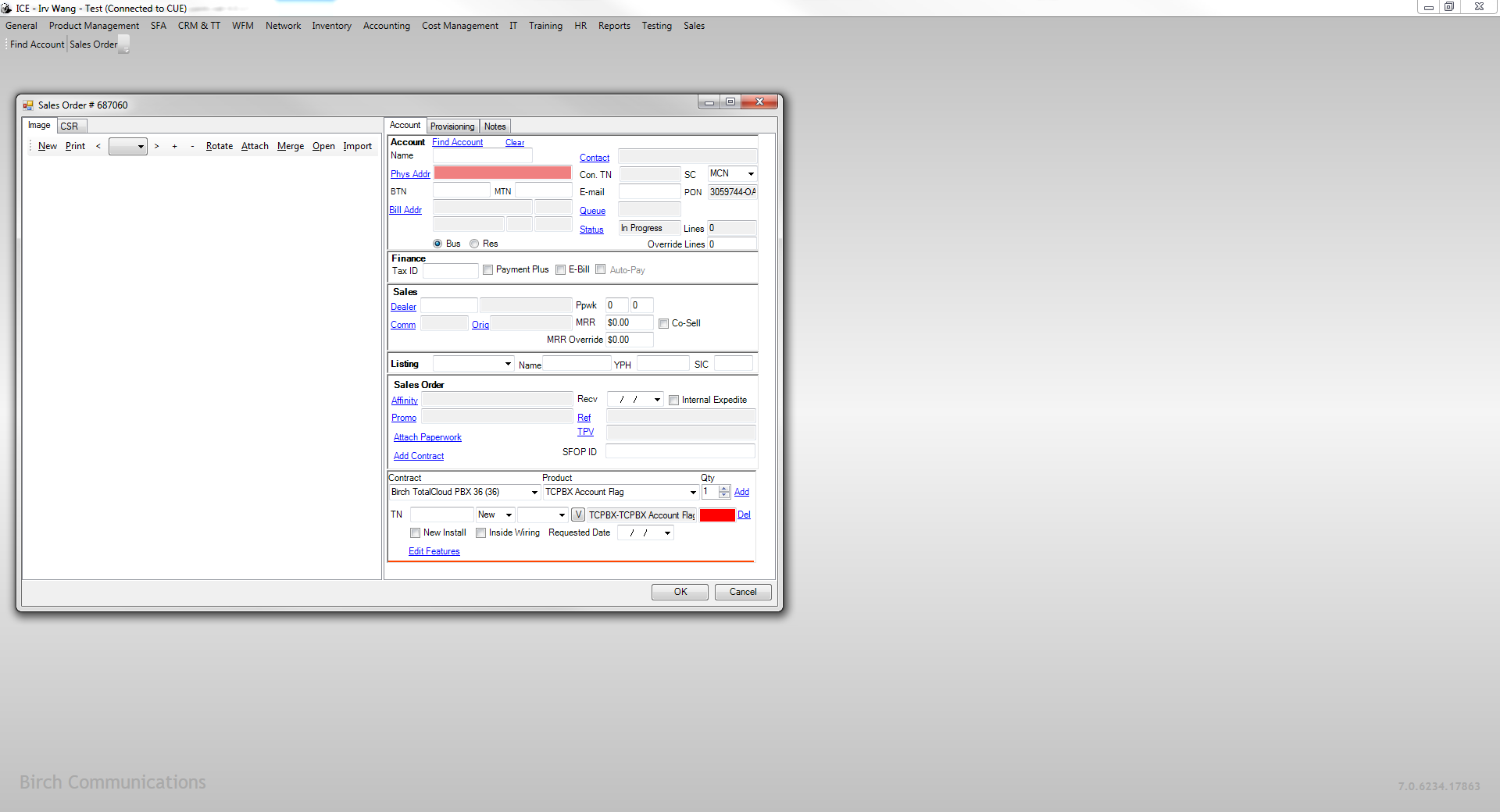
Another benefit of moving ICE to the web was gaining the ability to fully leverage responsive design principles. Again, while I cannot speak to how smoothly this could have been implemented in a Windows desktop app, it is essentially a requirement for a web-based app. At small screen resolutions, ICE windows would run off the edge of the desktop, while at much larger resolutions, ICE left a sea of unused space on the desktop. Because there are situations where it may be useful to have multiple small windows on a large desktop, I specified that session states in CUE should work across multiple browser windows or tabs so users could still benefit from a multi-window app experience on a desktop computer.
Business Logic
The other major issue with ICE lied in how it handled extensive business logic in forms. This was less of a visual design effort than it was being able to verify that data subgroups were mapped correctly to their parent groups. Nonetheless, this was an extremely important factor in building a good experience for the app’s users. Whether it be selecting products in inactive product groups or products that were allocated to the wrong product group, errant data entries by employees in the operations center could become costly mistakes.
The effort to refine the business logic also created opportunities to simplify data groups in some instances. This had the benefit of reducing the amount of form fields or changing the layout and type of form fields shown, which translated to less clutter on certain screens.
Another benefit to come out of reviewing and refining the business logic was eliminating odd behaviors in the UI. In previous development, this was not prioritized and it led to inconsistent behavior, illogical screen states, and haphazard organization of unrelated data.
As I designed revised and new screens for CUE, I periodically reviewed and iterated the wireframe concepts with the product owner to ensure the screens would effectively address the issues described by the operations center team. As wireframes were approved, I created high-fidelity prototypes and built them in conjunction with our UI developer.
Build
Since CUE was completely new project development for Birch, I collaborated with our UI developer to determine project handoff points and decide how to construct and define the behavior for the UI. I wrote the CSS styling for CUE in Bootstrap 3 while our UI developer set up CUE to be a modularly architected front-end so that other business functions in ICE such as network engineering and HR could be ported to CUE at a later date without affecting the look, feel, and functionality elsewhere in the app.
Result
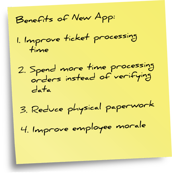
From an operational standpoint, CUE was a success as any SaaS migration would be due to users no longer having to worry about app crashes or periodic updates and downloads from the app server. Between the transition to a web app and observations I relayed to the development team regarding slow processing speed for specific tasks, CUE also featured notable improvements in the time to complete operations. Some of the speed improvements were also a product of new hardware for the server on which CUE resided.
The Director of Software Development identified operations center employees to be testers for CUE. The revised UI was praised for the improved organization and display of data. Improved use of screen space made navigation and finding data easier due to less scrolling. Refined UI behaviors reduced the time to complete tasks and eliminated usability traps from illogical screen states. Another frequently mentioned bit of feedback that was wonderful to hear was that CUE looked and felt like a native Birch app.
Subsequent development efforts focused on migrating additional business functions in ICE over to CUE so ICE could eventually be retired.