Background
The Birch customer support team was not capturing enough relevant service data from the BirchConnect customer portal contact form, leading to support technicians spending extra time with customers to verify the details of their support issues. In order to reduce the amount of discovery necessary for tier 1 support technicians, the customer support team wanted to capture more data before making contact with customers so they could better support them, and if needed, direct them to higher tier support.
Project Team
My Roles
UX Designer
Team Members
Business Analyst, Product Owner
Project Tasks
1. Research
Talk to potential customers and support technicians to learn their usage scenarios, examine how competitors capture info when their customers contact support
2. Design
Propose new design improvements to capture the required customer info while reducing the amount of discovery needed by tier 1 support technicians
Research
Rethinking the Problem
This was a situation where our product owner attempted to design a solution for the development team. Upon review, our development manager wanted to have a business analyst and me examine the proposal before proceeding.
The product owner felt that having the customer provide extra details in the contact form would achieve the desired outcome. When I reviewed the project, I had a theory that proposed solution would more likely lead to customers skipping the contact form altogether in favor of an increase in phone calls to tier 1 support technicians.
To gather more data points and feedback, I asked our business analyst as well as other colleagues in the company not in customer support for their input as to what they would expect as a customer when contacting customer support online for a service issue. I also informally interviewed a contact with extensive experience supporting customers at Sprint and Amazon for his input.
In my conversations, I learned that providing a lot of info up front in a form is not always feasible. In some cases, a customer would not know the answers to the questions that our product owner suggested. From the customer support side, I learned that support technicians do not expect to solve the customer’s problems without having to first establish personal contact. Even if they receive as many details about the issue as possible in a form, the customer-provided info may not always be accurate.
As a result of my research, I decided to look into alternative solutions that could be more beneficial to both the customer and the support team.
Making a Stressed Customer Fill Out a Form
BirchConnect had a secondary problem: The portal was not responsive or mobile-friendly. If your Internet service isn’t working, you might rely on your phone and your mobile data plan to access your service provider’s website. However, having to fill out a support form on a non-responsive website with horizontal scrolling and text not scaled for mobile viewports only adds insult to injury.
Back to the task at hand though, I saw the idea of forcing a frustrated customer to fill in even more detailed form fields to capture info as a greater nuisance than the previous, simpler form. Not only would the extra form fields become an unsolvable puzzle to less-technically inclined customers, but the inevitable phone call from a customer too aggravated to fill out a difficult form risked putting even more wrath at the ears of a tier 1 support technician.
Finding a Better Way
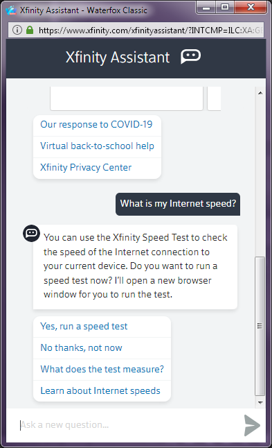
I already had an idea of how to design a more pleasant solution, but I needed verification. The most obvious parallel I could draw was Comcast’s Xfinity customer portal. While Comcast’s phone support has a seemingly inescapable and overwhelmingly negative reputation, one thing I did know was that if I ever had to contact them online, I would not have to fill out a web form with details such as the number of devices I had connected to my Internet.
The current Xfinity help solution is a virtual assistant interface in a chat window. While this wasn't something that could be easily adapted for Birch with their existing infrastructure, the concepts to be learned from this interface were still valuable for guiding customers who need assistance from customer support. Modern online customer support workflows focus more on progressively guiding the customer to potential solutions rather than immediately asking for a brain dump of info.
During the process of guiding the customer, the goal is that a solution can be found that reduces or eliminates the need for support technician intervention. This is how reductions to customers needing to contact tier 1 support technicians can be achieved. While Birch was not able to support this concept with a chat interface at the time of this project, they could still achieve the same goal without requesting an excess of info that the customer may not be able to provide.
Design
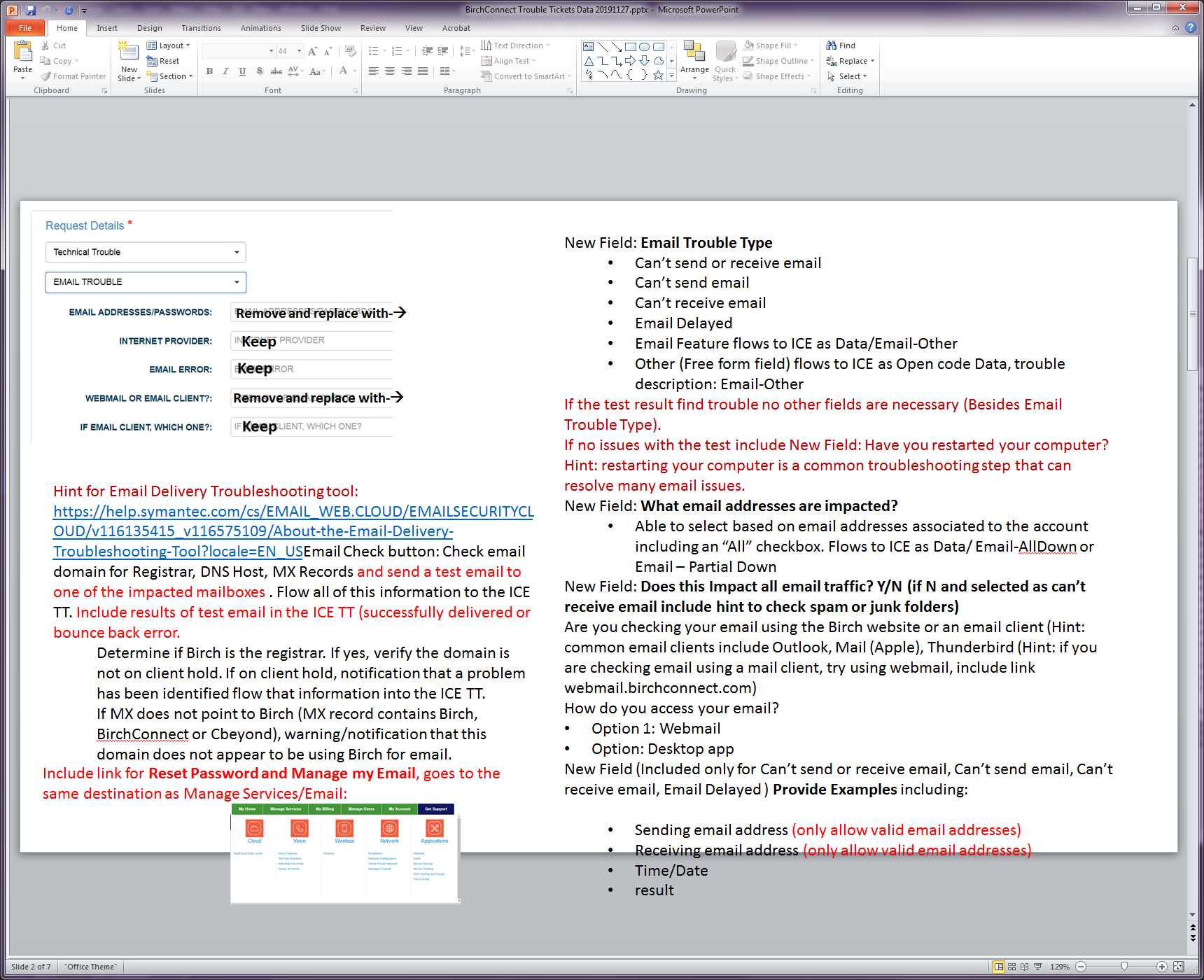
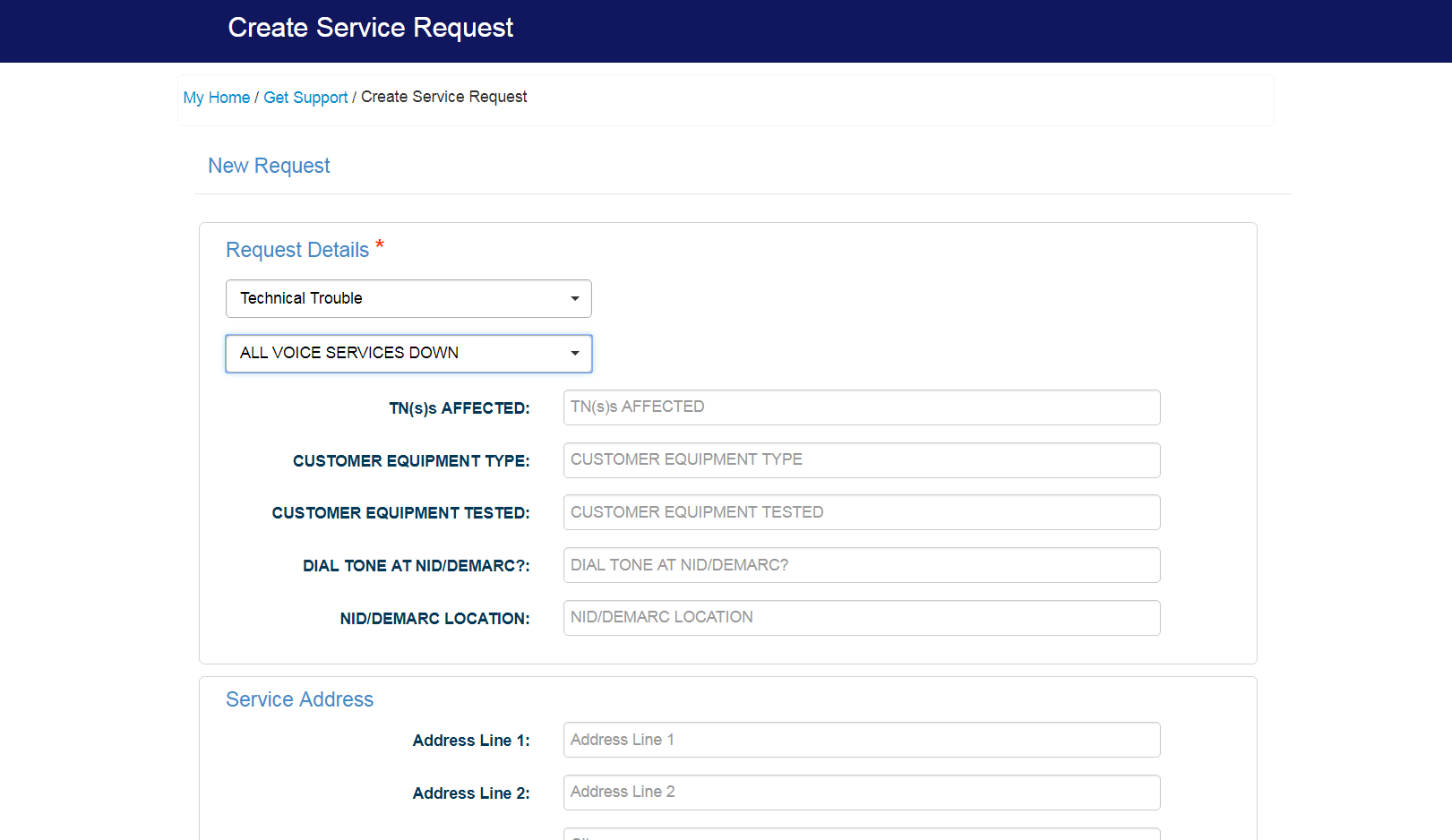
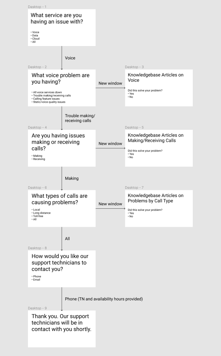
I wanted to design a solution that would simplify the data entry. Instead of filling out form fields, a more user-friendly presentation would be to ask the user broader questions in simpler language. A selection of responses would walk the user through a wizard-like interface that ultimately determines a probable cause and an appropriate course of action. While there may be some data entry involved such as providing a callback number, the end result would not force the user to fill out an entire page of form fields.
I created an example workflow and wireframes demonstrating how a wizard interface would work versus the form-based solution that was originally proposed. While the wizard interface would require business logic integration, so did customer support’s form-based solution, as their required form fields would change depending on the type of service outage. Since I was not fully versed in all of the business logic for Birch's support team, I built one example based on what I considered a likely path of questioning.
Each screen displays one and only one question in order to not overwhelm the customer. After each question, the wizard/assistant UI would allow the customer to review related topics in the support knowledgebase where the customer could attempt fixes and determine if they resolved the issue. If the issue is resolved, the customer could mark it as such and gracefully exit the wizard. If not, the next question is asked until the issue is resolved or it's determined that a support technician should contact the customer. I felt that limiting the number of questions asked to five was appropriate, although this could be adjusted as needed within reason.
Result
The product owner and the development manager both agreed that my approach was less intimidating to the customer and more likely to achieve the desired goals of reducing the call volume to tier 1 support technicians. The project was turned back over to the customer support team to define the required business logic, determine what questions they should ask the customer, and decide how they wanted to handle the potential responses to the questions.
This project was less of an exercise in building a finished product than it was preventing a bad product solution from being implemented. While I cannot show much in the way of deliverables for this particular case study, I do believe it illustrates the need to understand human factors in creating design solutions. Creating a good user experience is about creating positive connections with customers through a human-computer interface. At the very least, we should not create solutions that will inconvenience customers, as that is often a significant contributing factor in customer churn.
Another takeaway from this project was successfully collaborating with a product owner despite having different ideas on what the solution should be. I believe that it was important to show that even though I had reservations about the original proposed solution, it had to come from a place of best representing the end user and I needed to provide sufficient evidence and reasoning to support that. Ultimately, as a UX designer, I would not be acting in good faith if I unilaterally judge the viability of a design solution and neglect to recognize that the intended audience is the end user, not me.