Background
The old ManagedTel portal had numerous user interface issues that needed to be addressed for the portal to look like a professionally designed application. Customers had complaints about the difficulty of accessing content and the training manager frequently had to talk around some of the portal’s design quirks when presenting it to new customers.
Project Team
My Roles
UX Designer, UI Designer/Developer
Team Members
Product Owner (CIO), Customer Training Manager, Software Architect
Project Tasks
1. Test
Identify usability issues and other areas in need of improvement
2. Design
Improve portal aesthetics and create a cohesive design theme
3. Build
Integrate design changes with the front-end codebase
Testing the Existing Portal
The team brought me on to primarily focus on improving ManagedTel, as this was the product most widely seen by the company’s customers. As I was given the rundown of the app’s purpose from the product owner and the training manager, I worked to identify the areas where users were having the most trouble with the portal. For additional history on the portal, I spoke to the development team, as they had built it to its current state without any UI/UX design direction prior to my hiring.
Thinking as an end user with a design background, I was able to record my difficulties with using the portal. Ultimately, the key issues were:
- The old dashboard page wasted screen space. Discussions with the developers revealed that they struggled with ideas of what to put on it.
- The portal navigation was vague and didn’t effectively differentiate various sections of the portal. The training manager also stated that customers would often ask about how to access content that was not linked directly from the navigation.
- The different sections of the portal, known as modules, had many visual issues from inconsistent design to improperly prioritized data presentation, which collectively overwhelmed the user with a cluttered interface.
Design Focus Areas
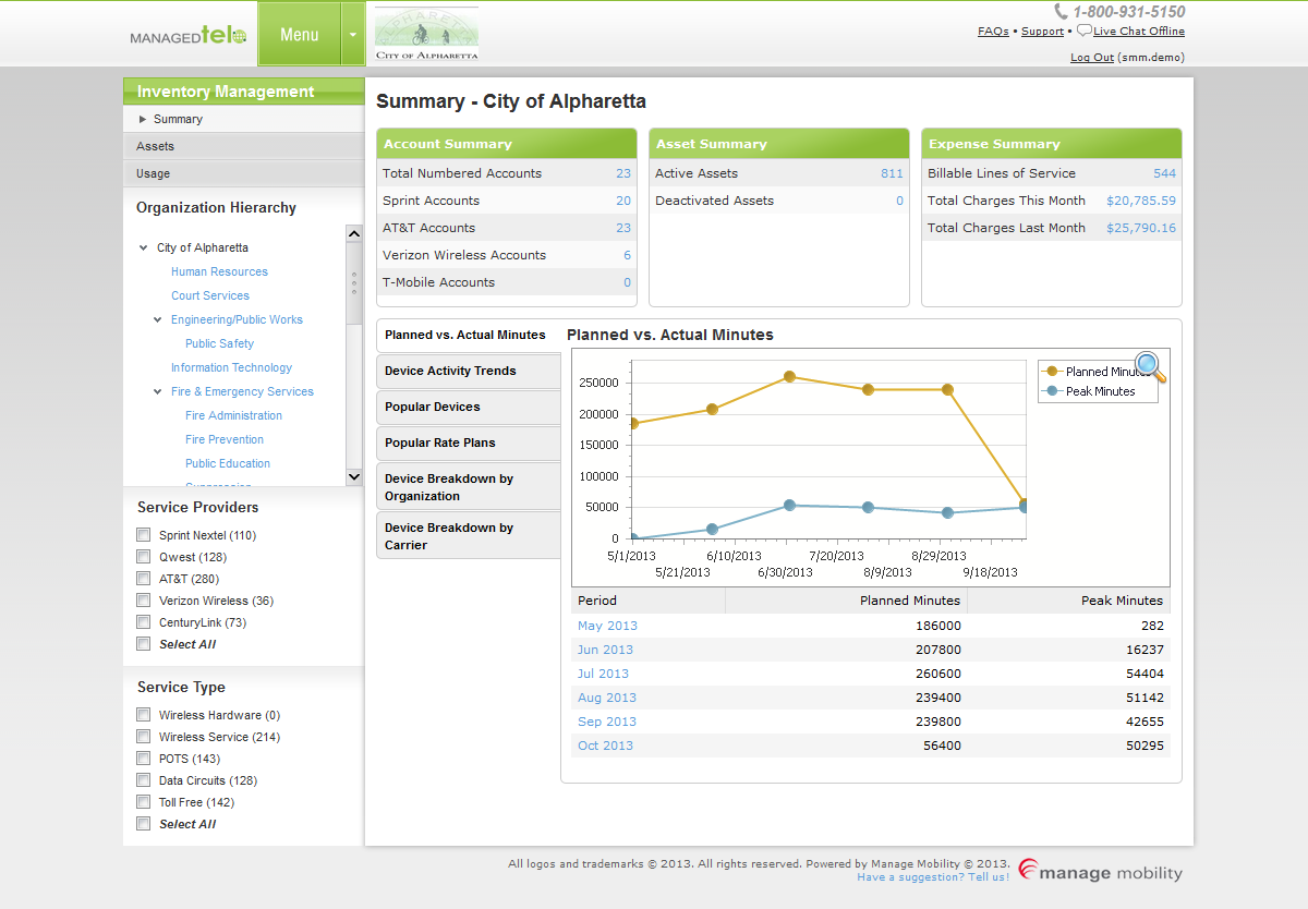
Dashboard
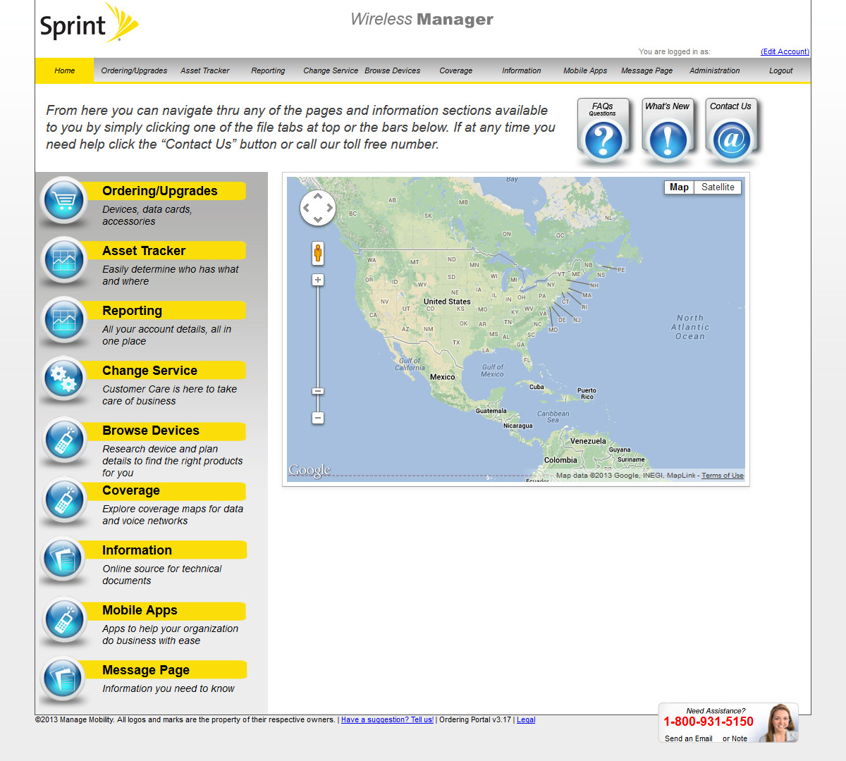
First impressions are important, and ManagedTel was not making a good one. The previous dashboard did not feature any meaningful content. It was merely repeating the topbar navigation along the left side and presenting an unmarked instance of Google Maps, so it effectively served the same utility as a blank page.
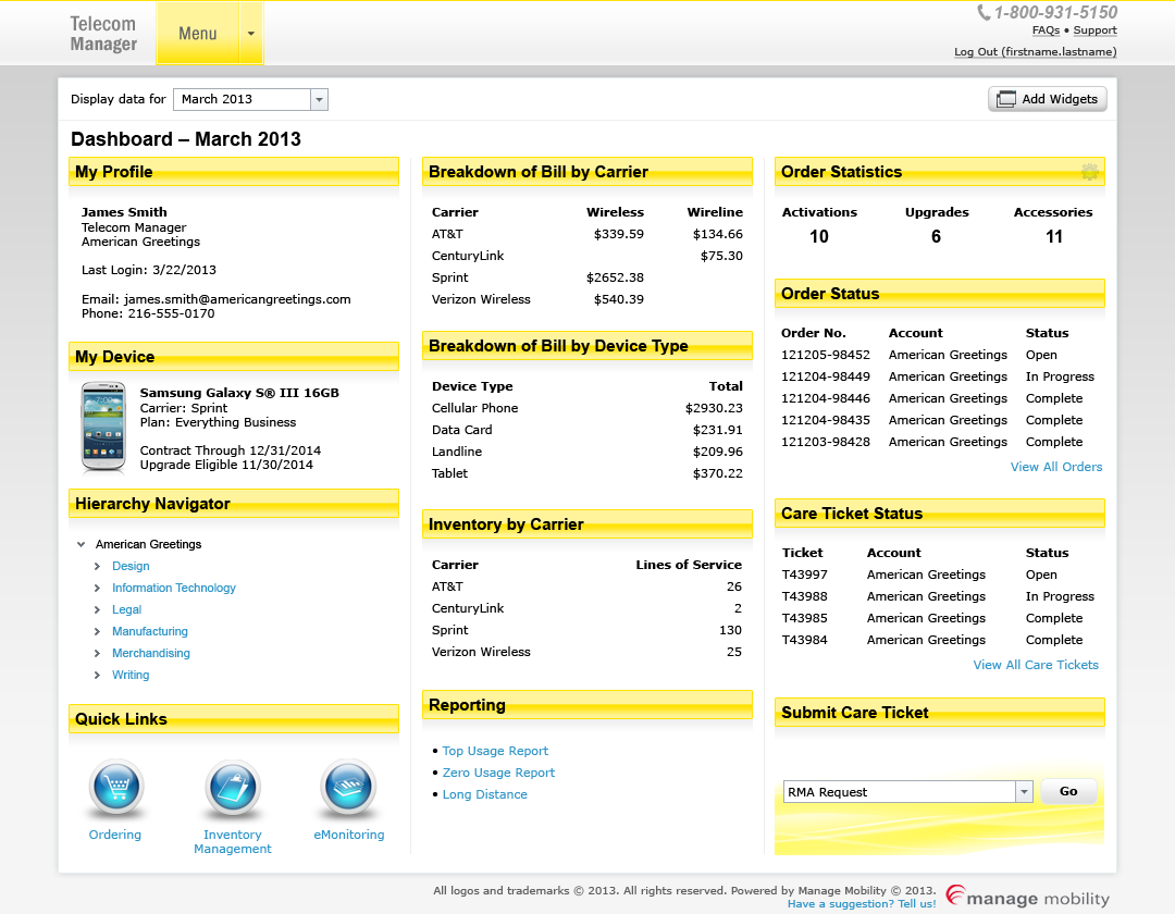
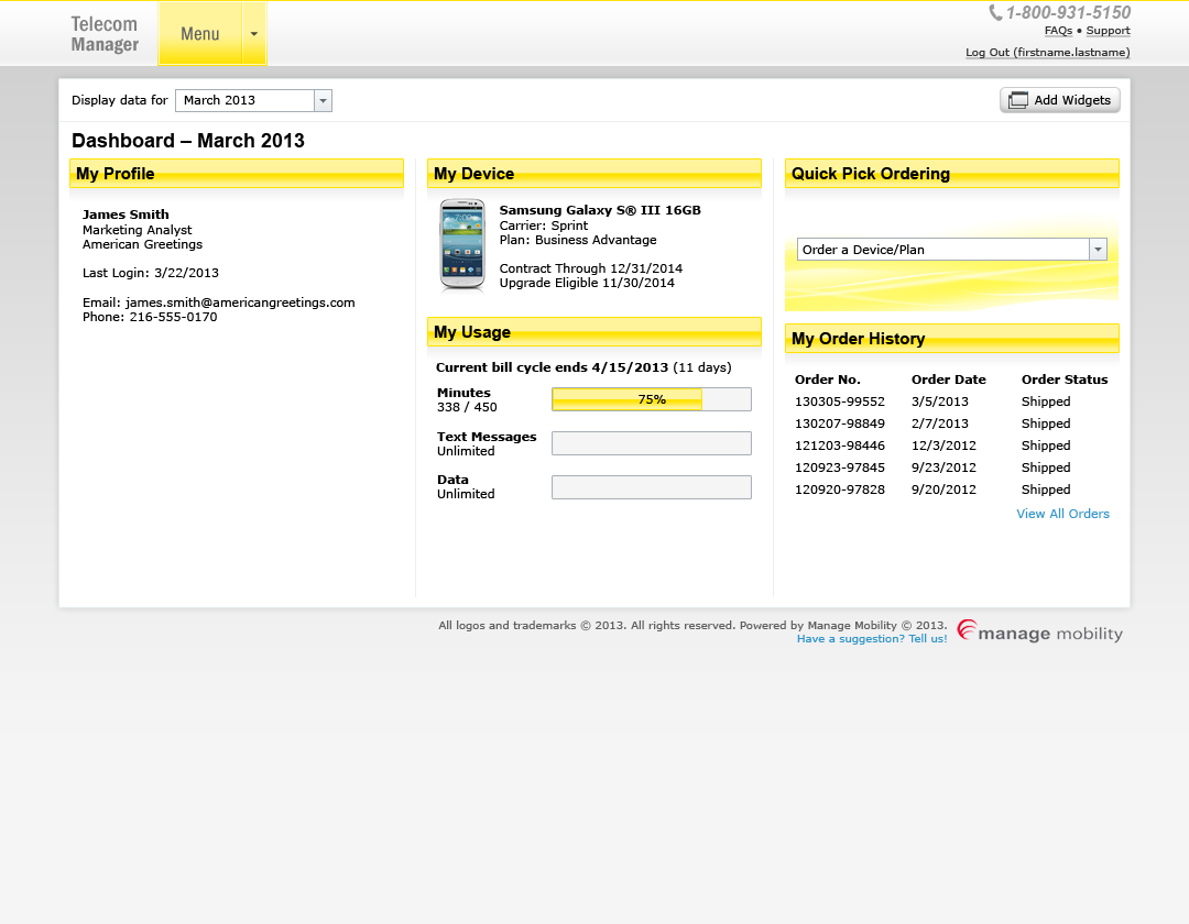
I decided to create a new user-customizable dashboard to show the logged in user the most important information pertaining to their account. The dashboard featured customizable widgets that could show account information, billing data, order statuses, device data, and more. The ability to customize the dashboard allows an account manager to create different user roles and show different widgets as applicable for a given role.
Portal Navigation
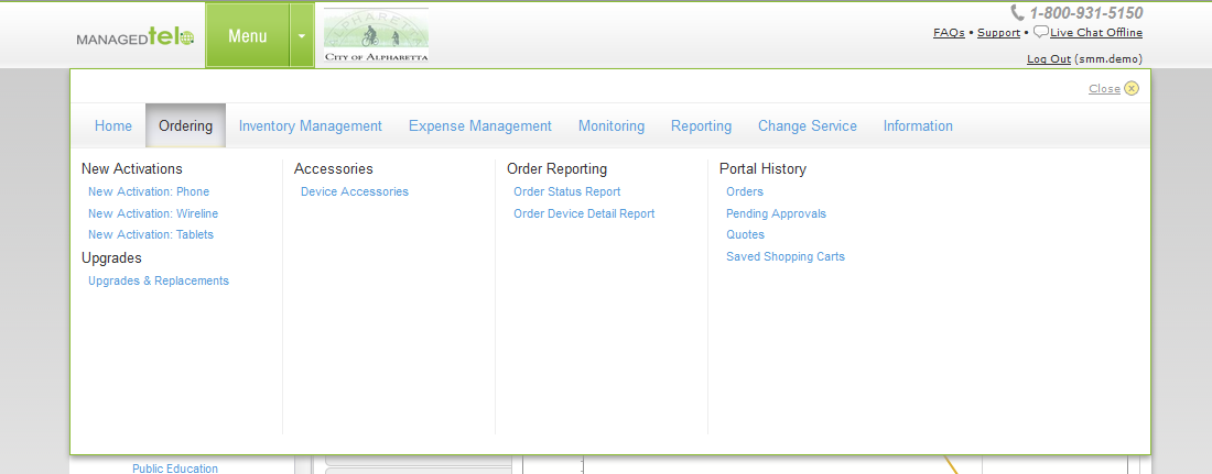
To address the navigation, I had to review the existing site architecture. This led me to discover that there were over 50 different pages within the ManagedTel portal and very few of those pages were directly accessible from the old navigation.
Based on my research of other major websites that had numerous pages in its hierarchy, my solution was a categorized supermenu that would allow the user to access most pages in the portal with no more than three clicks. Since ManagedTel is a data-driven app rather than a website, I also chose to keep the menu out of the user's way during regular use until it was needed.
Module Design
The module pages were composed of various different component libraries that were not properly styled to match each other. This led to colors and content competing with each other on the screen for the user’s attention. To remedy this, I made high-fidelity prototypes of the interface components with a unified design aesthetic.
I also designed a tabbed interface for a larger data chart display to create a central focal point for a module rather than litter the screen with many different small charts that hurt readability and increased page scrolling. Showing one chart at a time also helped speed up page load times over loading up to a dozen different charts at once.
Finally, in working with the product owner, we determined what data actually needed to be shown on a given screen, as some modules were displaying information that was irrelevant to the module. This further aided the effort to reduce screen clutter.
Integrating Design Changes the Hard Way
As ManagedTel was originally built on ASP.NET Web Forms before a later migration to an MVC model, I had to implement the design improvements directly in the codebase. Since these changes to ManagedTel primarily focused on the app’s presentation layer, I wrote the HTML and CSS to reproduce the high-fidelity prototypes that I designed.
Our team used a handful of third-party libraries for some page components, such as the FusionCharts library for the data charts. I also upgraded our license for FusionCharts to the latest version and made extensive customizations based on their documentation so the charts would fit in with the ManagedTel visual style.
Result
User feedback on the revised ManagedTel portal was very positive, especially regarding the new dashboard and the revised navigation. Content was now easier to find and existing customers were pleased with no longer having to bookmark pages deep within the site’s hierarchy. The visual improvements were also praised by the training manager and the marketing team who could now present the new portal with confidence knowing that a better-designed product could help enhance sales.
Even though this project dates back to 2013, I still consider ManagedTel to be one of my favorite visual design enhancement projects. While modern portal and app design aesthetics are often simpler in style and modern front-ends are now built responsively to adapt to different viewports, many of the presentational improvements that I made for ManagedTel are still conceptually relevant today for directing the user’s attention to specific locations on the screen.