Background
Primus’s eCare customer portal needed an overhaul, not only to update its look and feel, but to address shortcomings in its workflow and layout so that it could be on par with the customer portals of industry competitors. Along with this effort, the marketing team sought to relaunch and rebrand the customer portal as MyPrimus.
Project Team
My Roles
UX Designer, UI Designer/Developer
Team Members
Project Manager, Product Co-owners (Director of Customer Support, Residential Product Manager), Marketing Manager, Service Applications Development Manager
Project Tasks
1. Research
Evaluate existing portal, compare and document portal interfaces of industry competitors
2. Design
Create new wireframes and prototypes of a redesigned customer portal in accordance with Primus’s branding guidelines and any required copy and content from the marketing team
3. Build
Define the front-end framework, create the front-end code for the new MyPrimus portal
Research
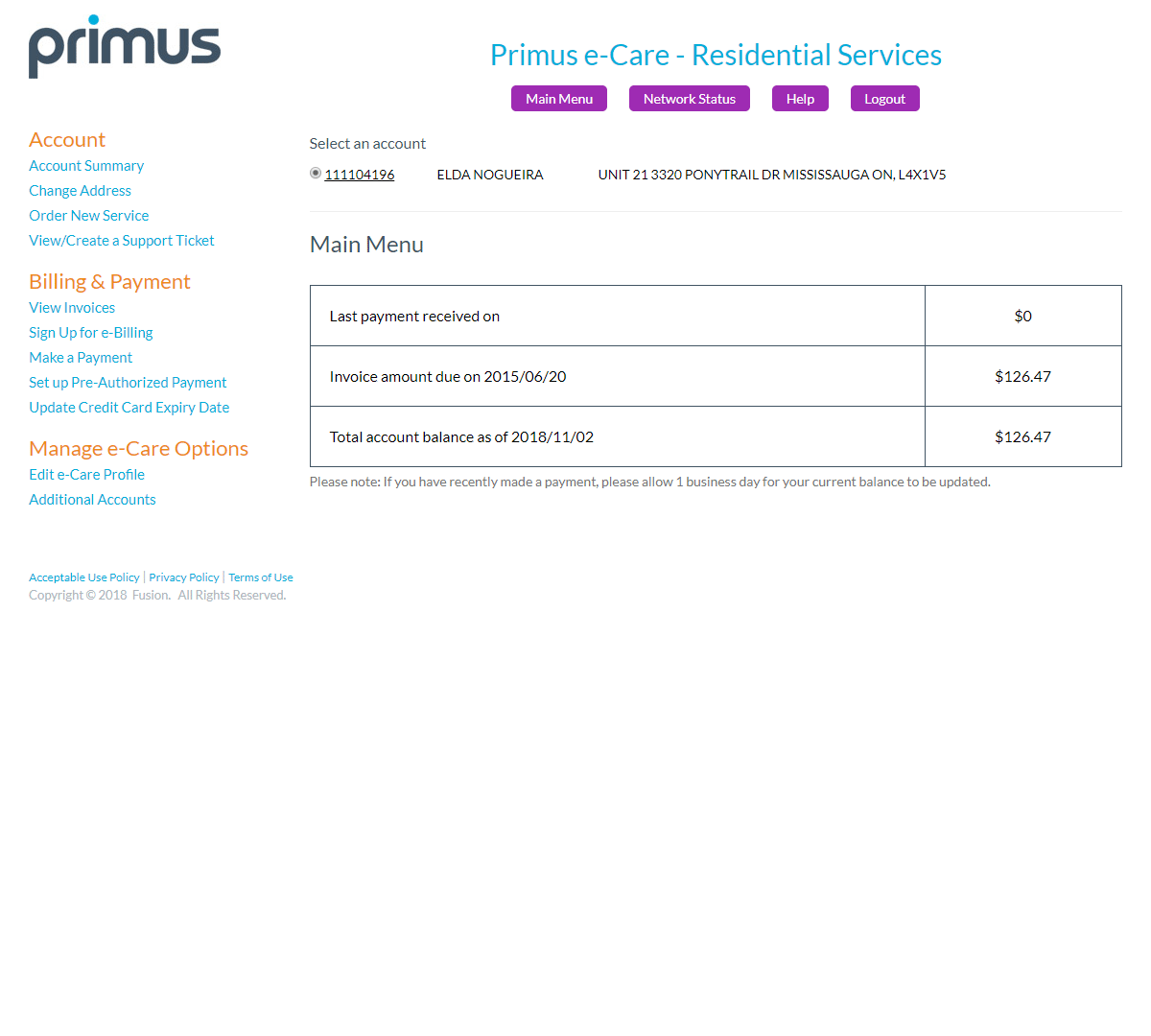
I examined the existing eCare portal to identify possible areas of improvement based on personal experience with consumer utility portals. As this portal was originally created in the mid-2000s, it was designed for desktop browser viewing and did not include responsive design features. Additionally, a couple of other areas of potential improvement that stood out were screen space utilization and portal navigation.

Performing competitive market research was an obvious step considering the portal was in the consumer utility space. I compared the existing Primus eCare portal with those of companies like Comcast which are in the same industry, and other utilities such as Scana Energy and Georgia Power for general layout and organization concepts common to many consumer utility portals. Meanwhile, team members in Canada were able to advise me on how specific telecom product features or components were presented on the portals of their competitors in Canada such as Bell, Rogers, or Telus.
Design Focus Areas
Starting with a full stack of wireframes and proposed changes for each functional section of the portal, I embarked on a complete redesign effort of MyPrimus. Here are some key areas that were given extra attention during the design process:
Navigation
Prior to starting design, I performed an informal card sort exercise on the eCare site map. I recorded the titles of the navigation links, stripped away the link categories, and then re-sorted the links with new categories based on intuition. I discovered in this process that some navigation links were either redundant or too granular, such as the ones involving payment methods. Next, I compared my newly sorted categories and links to other portals to see what site features may still be missing and could be added to MyPrimus. For instance, I noticed that other portals often had a support article knowledgebase for customers to self-diagnose issues.
The end result of this exercise provided the team with the underpinnings of a refreshed site map that better reflected the pages in modern customer service portals. Additional alterations were made during the process of wireframing as the team made adjustments to portal content.

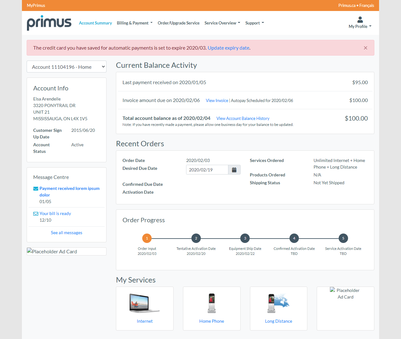
Layout
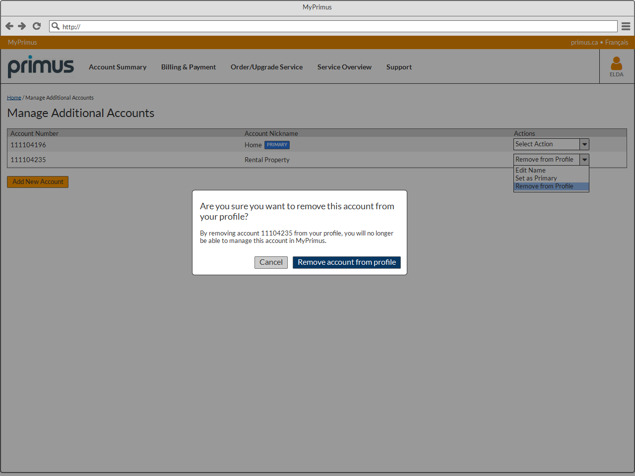
In addition to designing the portal to be responsive to different viewports, I wanted to better utilize color and typography to draw the user’s attention to important areas of the portal. I also incorporated modern design elements such as toast messages and modal pop-ups to relay important status and page state changes.

Branding
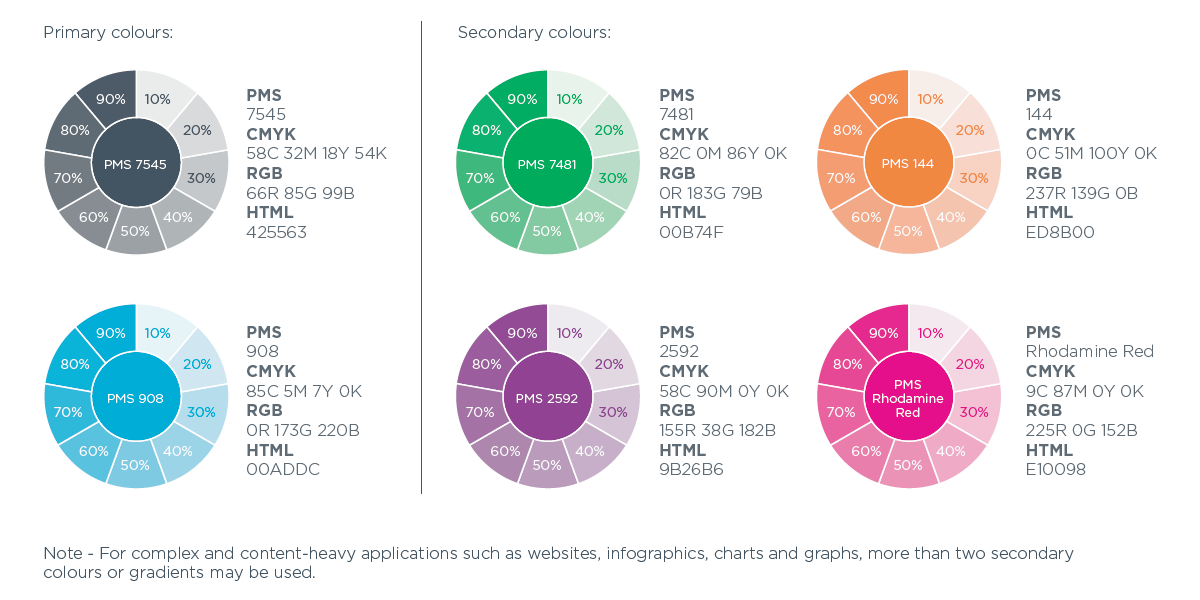
As this portal redesign and rebranding effort followed a redesign of Primus.ca, I leveraged Primus’s style guide and consulted with their web manager to understand how colors were used on the main website. For instance, purple buttons were associated with transactional calls-to-action involving products, so an “Order” or “Add to Cart” button in the UI would be purple. Different colors also represented different sectors of the business, so for example, home service portals were orange-themed while business service portals were blue-themed.

Screen Space
One significant issue with both usability and layout on the eCare portal was its overreliance on explaining how to use each screen’s functions in a sidebar on the page. As a user, I feel that if you have to explain how to fill out a web form, then the form is too complicated. An abundance of explanatory text also clutters an interface and makes it harder to be mobile-friendly.
In the few places where context-based help would have been useful such as explaining what a specific form field was, I moved those tips to a small, dismissible pop-up tooltip. The screen space gained from removing the sidebar went towards more appropriately sized form controls, especially for mobile viewports.


Building from Scratch
As the Primus team did not have any front-end developers and this project did not leverage any existing Primus code libraries, I also had to take on the task of building the actual front-end codebase. WIth this in mind as the sole UI/UX resource in this project, I opted to make the high-fidelity prototype the front-end codebase to streamline the work to be performed and save time in what would have otherwise been an even longer process.
As a result, early in the design phase, I planned to design and build the portal with the Bootstrap 4 CSS framework so that the need to make future changes could be done with the confidence that documentation for such a ubiquitous platform is readily available on Bootstrap's website. I also thoroughly documented additional design customizations in the project’s Sass files for future reference by the development team.
Result

The beginning to the end of the design phase lasted approximately 1.5 years from initial studies to completion of the code-based prototypes. The end result is a portal that brings MyPrimus in line with its competitors in providing a solid portal user experience for 2020 that works optimally across both desktop and mobile platforms.
The Primus team was thrilled with the results and the design gained the approval of all the stakeholders involved in the project. The development team is in the process of implementing the new design along with making extensive and necessary improvements to an outdated back-end.