Background
Velocity Automotive Solutions had a variety of UI improvements needed for their customer-facing web applications. While these tasks were individually much smaller in scope compared to some other projects I've highlighted, this type of work is the bread and butter of UI design where attention to detail can make the difference between an acceptable and a poor user experience. One of these tasks was to improve the VelocityEngage dashboard’s responsive behavior for narrower viewports.
Project Team
My Roles
UI/UX Designer
Team Members
Product Owner, Developer, QA Engineer
Project Tasks
1. Research
Evaluate the use case and requirements of the software in mobile viewports
2. Design
Propose design improvements to reflow data in various viewports and define expected behaviors in specific usage scenarios
Research
Oftentimes, a good user experience is transparent, but a bad experience sticks out like a sore thumb. This was an effort to make the swelling go away.
These days, we take for granted that many application interfaces are at least unobtrusive if not flawless to the end user. However, this is not always the case with smaller software design and development efforts. A lot of software that people use isn't designed by large household name corporations with abundant resources dedicated to UX. This is one such scenario. For this task, as a smaller UI effort to fix this dashboard view rather than a deeper dive into evaluating the UX of the entire product, takeaways from this exercise become a foundation and proof-of-concept to improving similar issues throughout the rest of the product.
I took over a partially completed effort to build a prototype of Velocity's web portal in reduced-size viewports, and this portion focused on a product offering called VelocityEngage. Before these prototypes were completed, other efforts were already underway to enhance the dashboard’s features in desktop view, which meant the designs of those new features had to be implemented from scratch in narrower viewports as well.
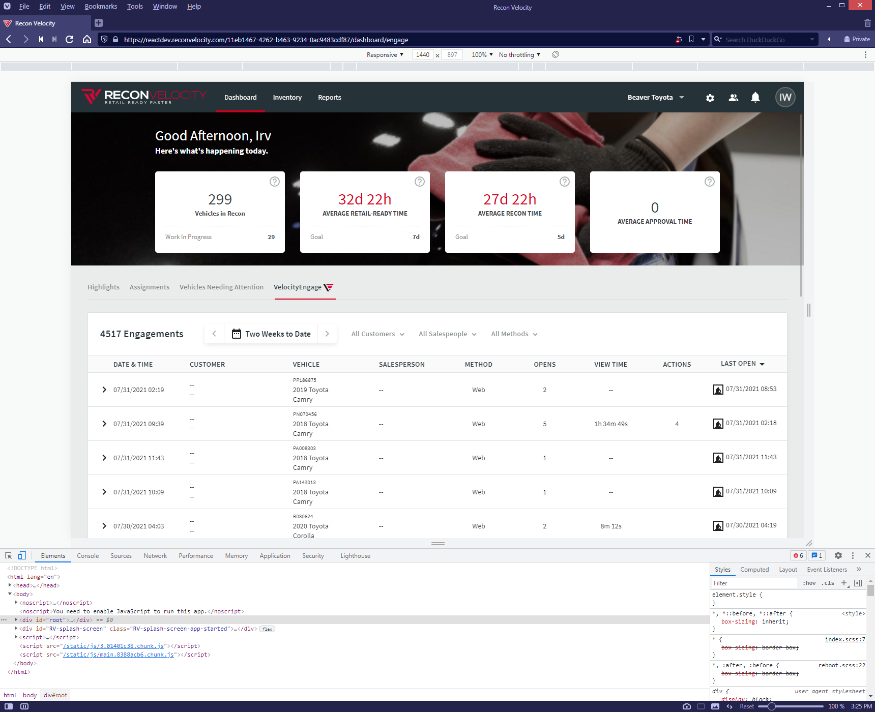
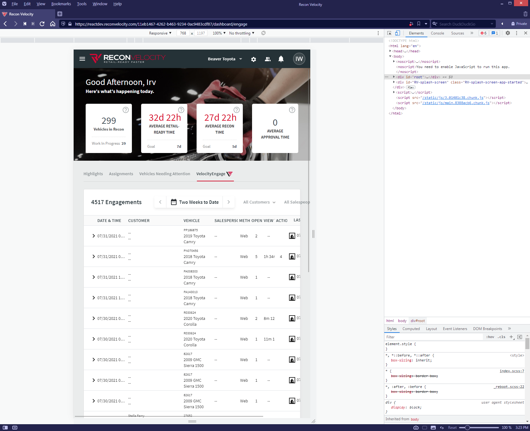
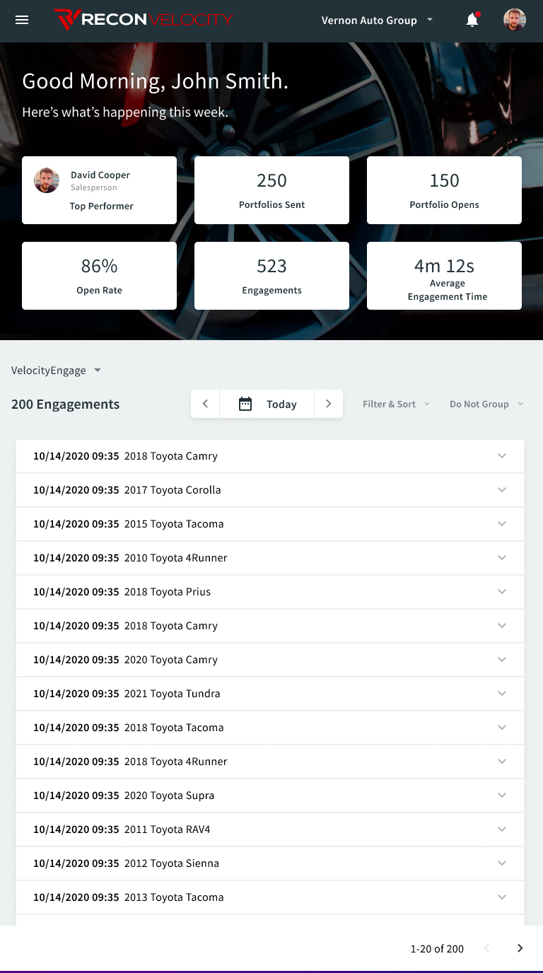
In looking at the desktop view, there were a number of data filters and grouping functions that sat atop the data grid. As this was the B2B portion of the application, while we evaluated the likelihood of a user perusing the dashboard on their mobile phones to be a rare occurrence, we wanted to provide the same degree of usability for the app, which meant all the data would have to be shown on the screen in smaller viewports. At a minimum, it was likely that a person working at a dealership could access the dashboard on using a tablet while walking around on the showroom floor or in the parking lot.
Given this, it was obvious that the viewport scaling issues were something that had to be addressed, as the original bug reported in Jira was quickly moved up in the backlog priority by the product team.
Design
Admittedly, this narrative will dive into finer detail of indivudual UI components as well as the micro design decisions that relate to them, but in the absence of better-defined UI patterns in the app, these design decisions become critical.
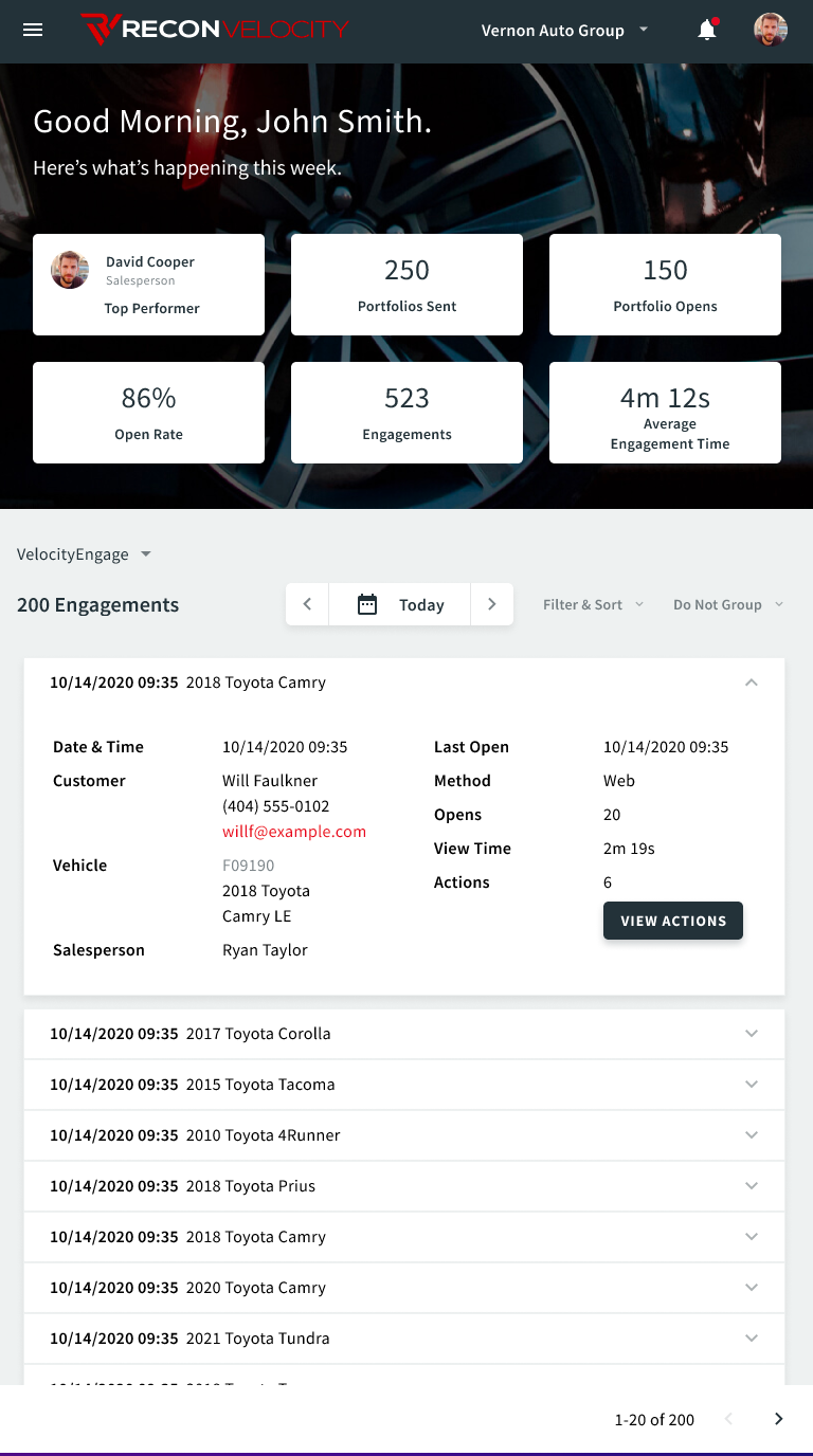
The first order of business was obviously reflowing the data grid to prevent column degradation and horizontal scrolling. I implemented a card layout to represent each row in the desktop view’s data grid. Another key feature of the desktop view is the accordion row that expands to view tracked user actions and opens for each engagement. I had to provide that functionality for each card as well.
Also, in desktop view, the trigger for each accordion row was clicking anywhere on the row other than a specific table cell that linked elsewhere, such as a direct dial phone number or a vehicle detail page. In mobile view, clickable areas need to be carefully considered and limited, as accidental screen taps are all too common, along with misinterpreted long press, tap, and drag gestures.
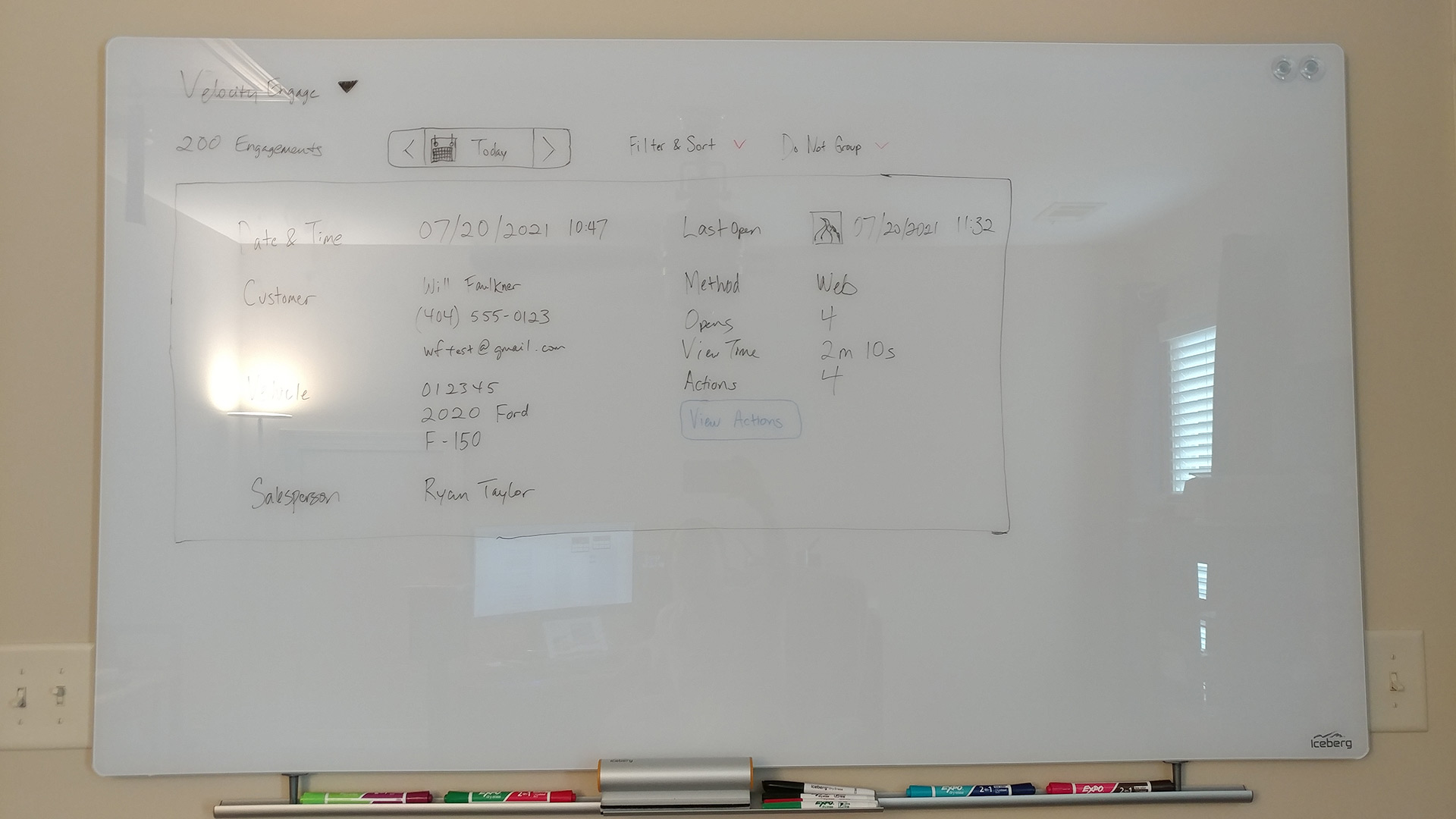
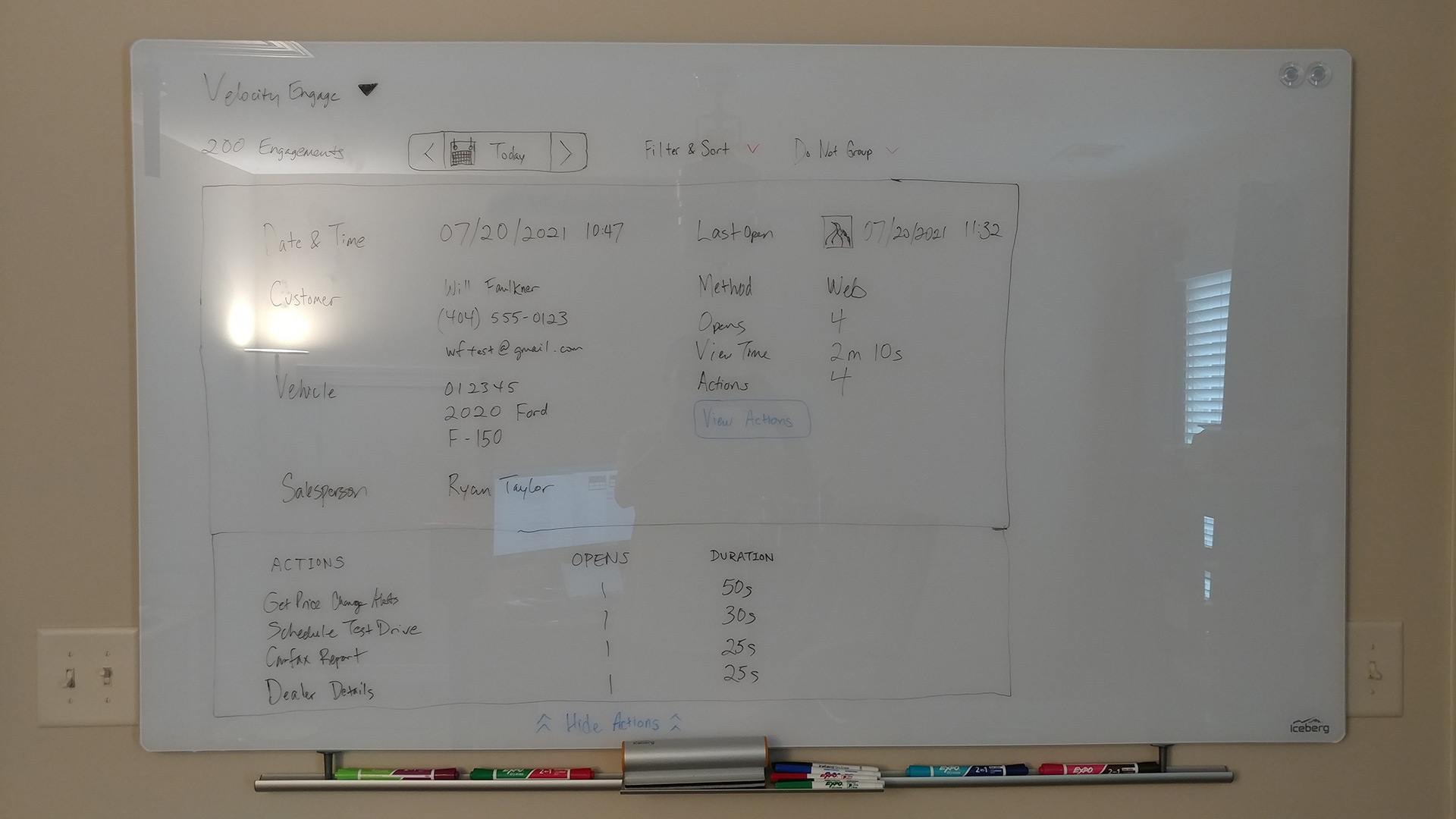
As this application's visual components were based on Material Design by way of the Material-UI React framework, I relied on the accordion documentation in Material-UI, also known as expansion panels in Material Design, to guide the interaction design behavior for showing each engagement in smaller viewports. The accordion rows reduce the height of each engagement to minimize scrolling. Each accordion row then opens up to show more details of the engagement, while another button within the expanded panel provides further access to view user actions.
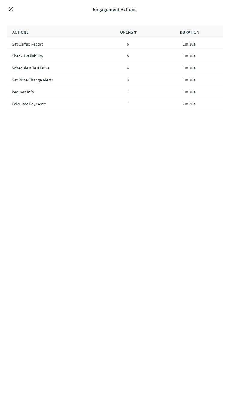
Although there were a few options on how to show/hide the user actions such as a toggle switch, button, or bottom-edge accordion panel, I decided that a button would probably take up the least amount of overall screen real estate while still providing a distinct visual target to access the additional data. Rather than nest accordion panels, I opted to display the user actions in a full-screen modal to avoid confusing the user with too many collapsible elements of differing hierarchical levels on a small screen.
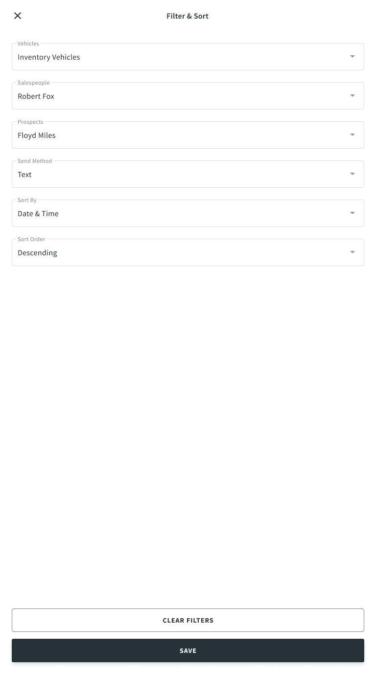
Another feature that needed to be ported over to smaller viewports was the ability to sort rows of data grid information by the column heading in ascending or descending order. I added this capability to an existing filter selection full-screen modal in order to minimize the need to create new screen states and fill existing whitespace that was otherwise going to be left unused.
Result
The end product was a view that behaves in a manner that is much more familiar and consistent for mobile device users. The QA engineers especially welcomed this change as it addressed responsive viewport issues they had expressed about the portal in previous sprints. Likewise, standardizing the use of Material-UI components made the developers' jobs easier given a lack of detailed design specs written in previous development efforts for the VelocityEngage dashboard.
While user feedback is still pending due to how recently the change was implemented, I can speak confidently that even the most incremental steps forward on the dashboard would have been welcomed. In this case, although there is always room for further improvement, I believe I took care of the overarching UI issues in one pass. Now these changes must be implemented on a wider scale across the application where necessary.